Education Access App
Year
2024
Project Type
Educational, Case Study
Role
UX Generalist
Our app will let users search for free courses. We will measure the app’s effectiveness by how many users register for classes.
Project Overview

The problem:
Users have a difficult time knowing which institutions offer free classes.

The goal:
Streamline the process of matching users to courses that align with the user’s goals and interests.
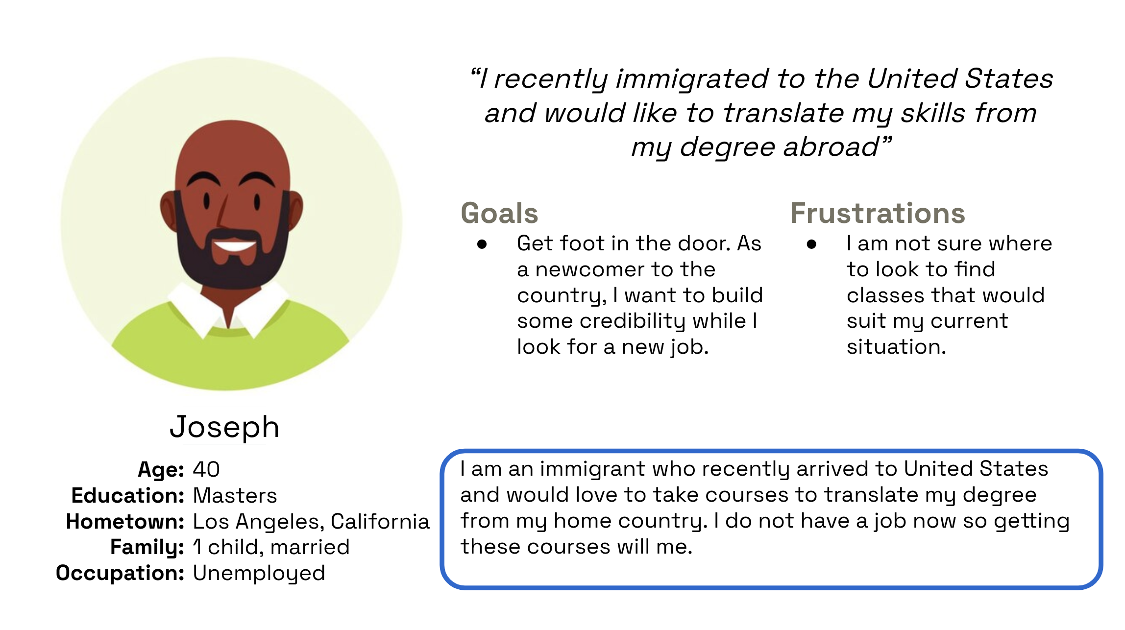
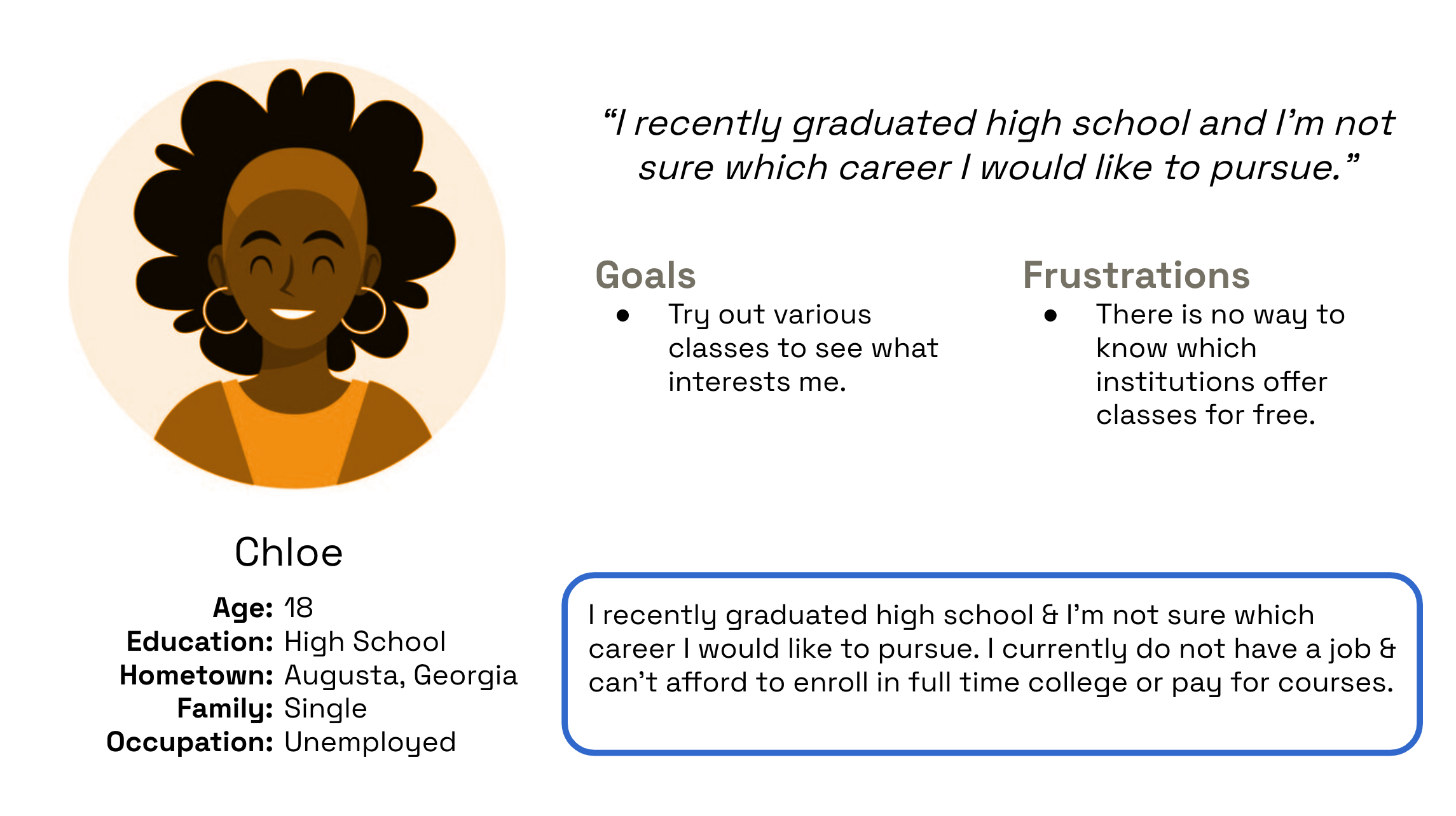
User Personas
Based off interviews with 5 individuals I was able to create the following two personas that well represent the potential users on the app.
User Journey Map
Building off the user personas, I explored the journey of the typical user through the app.

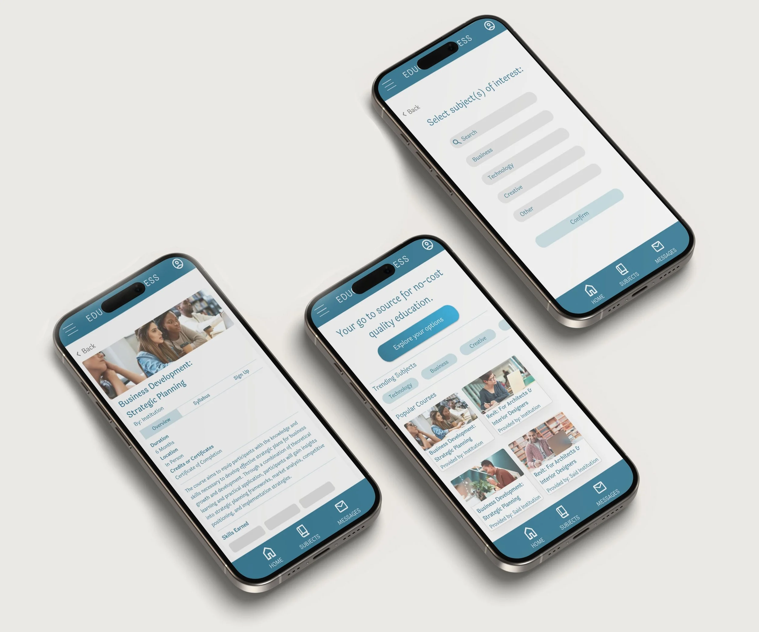
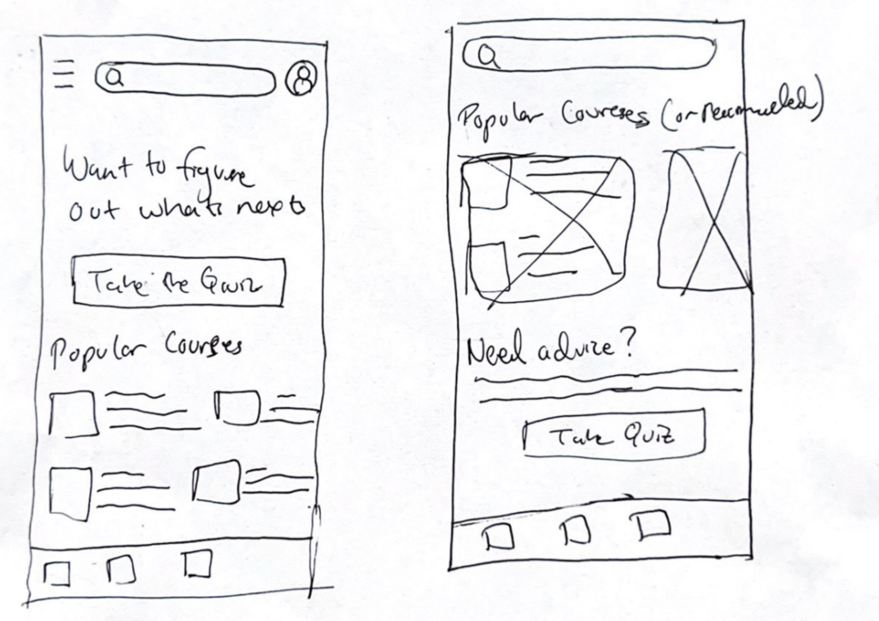
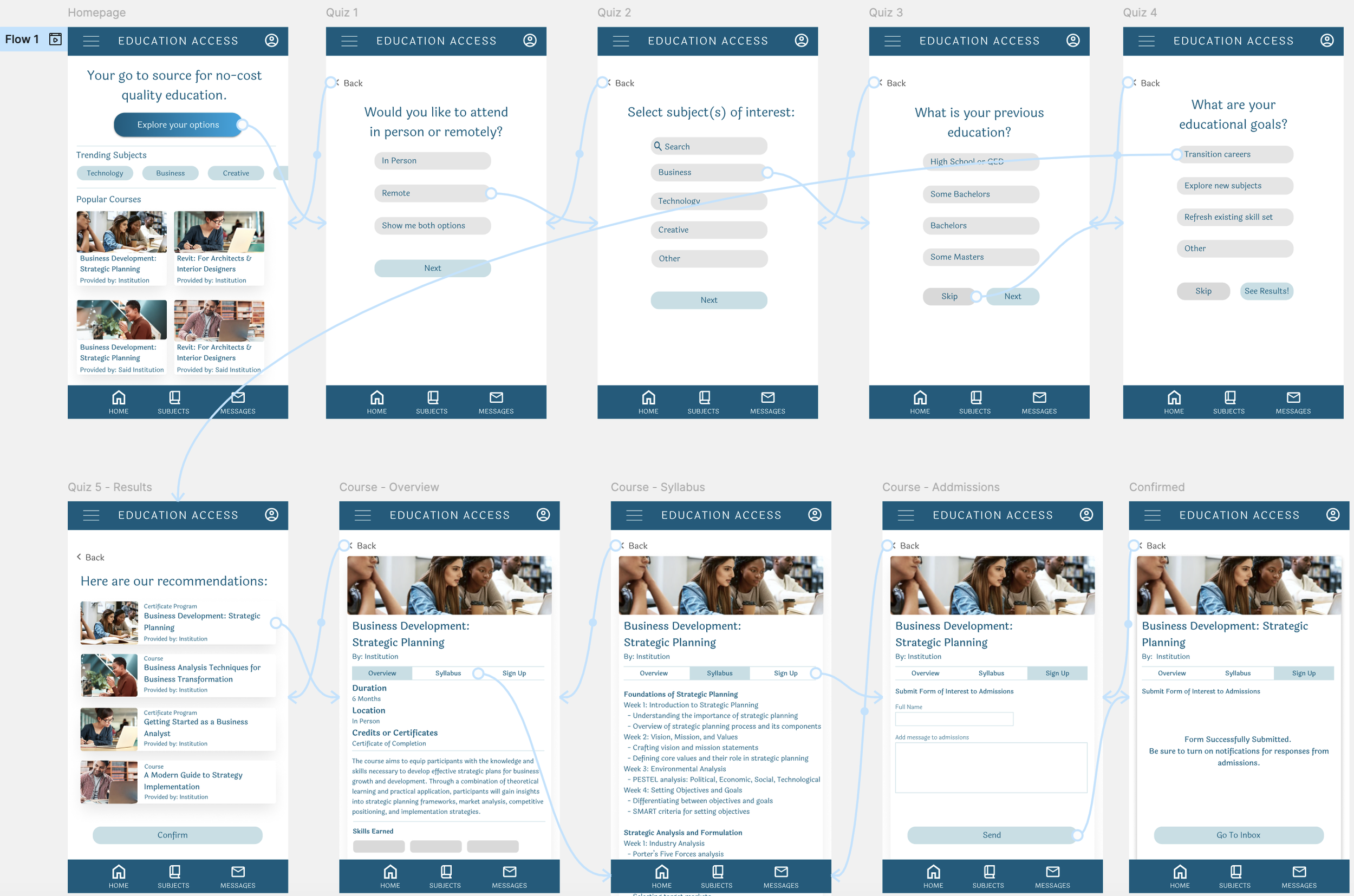
Paper Wireframes

Homepage Options
Main User Flow
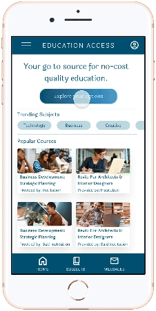
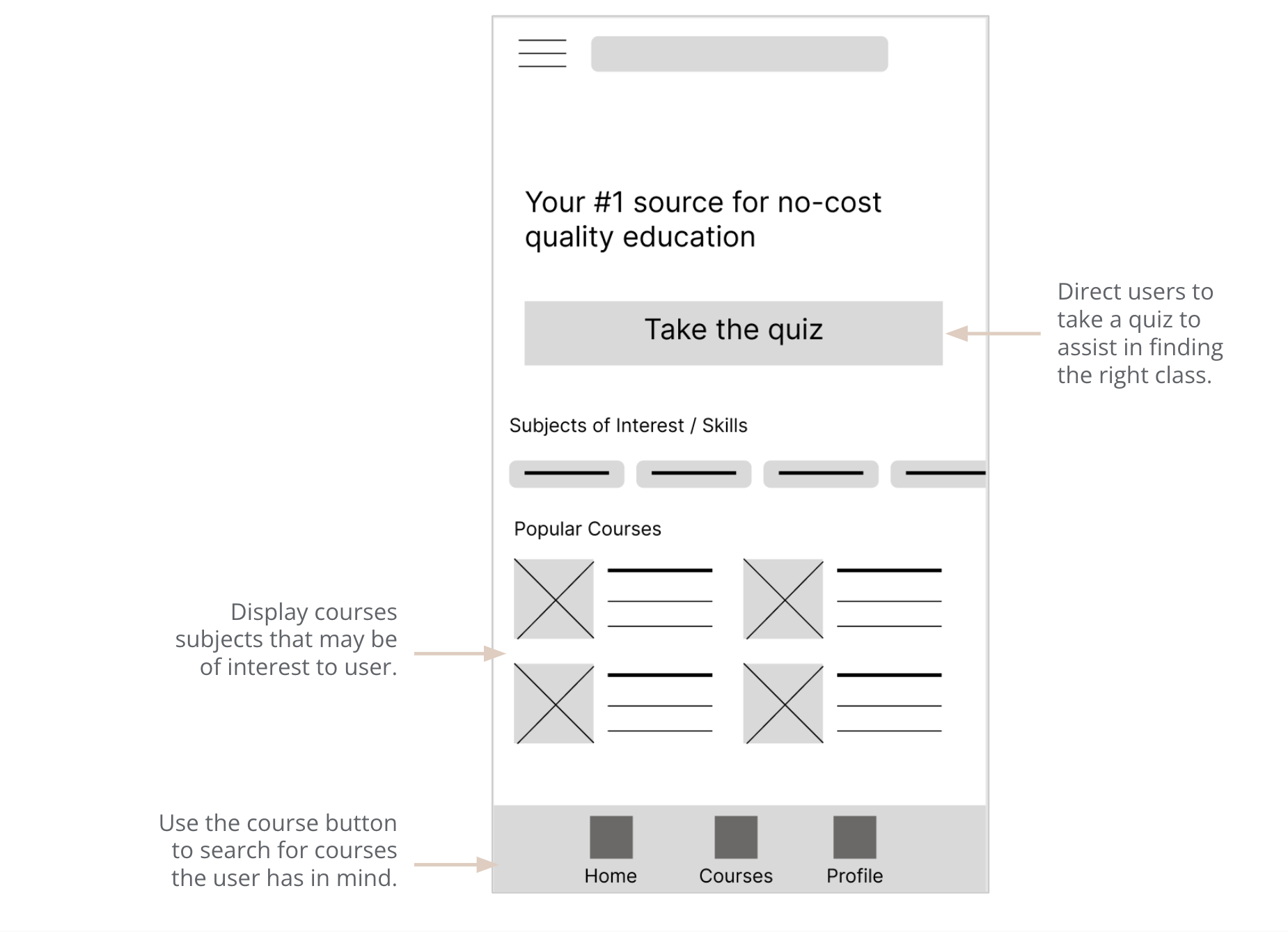
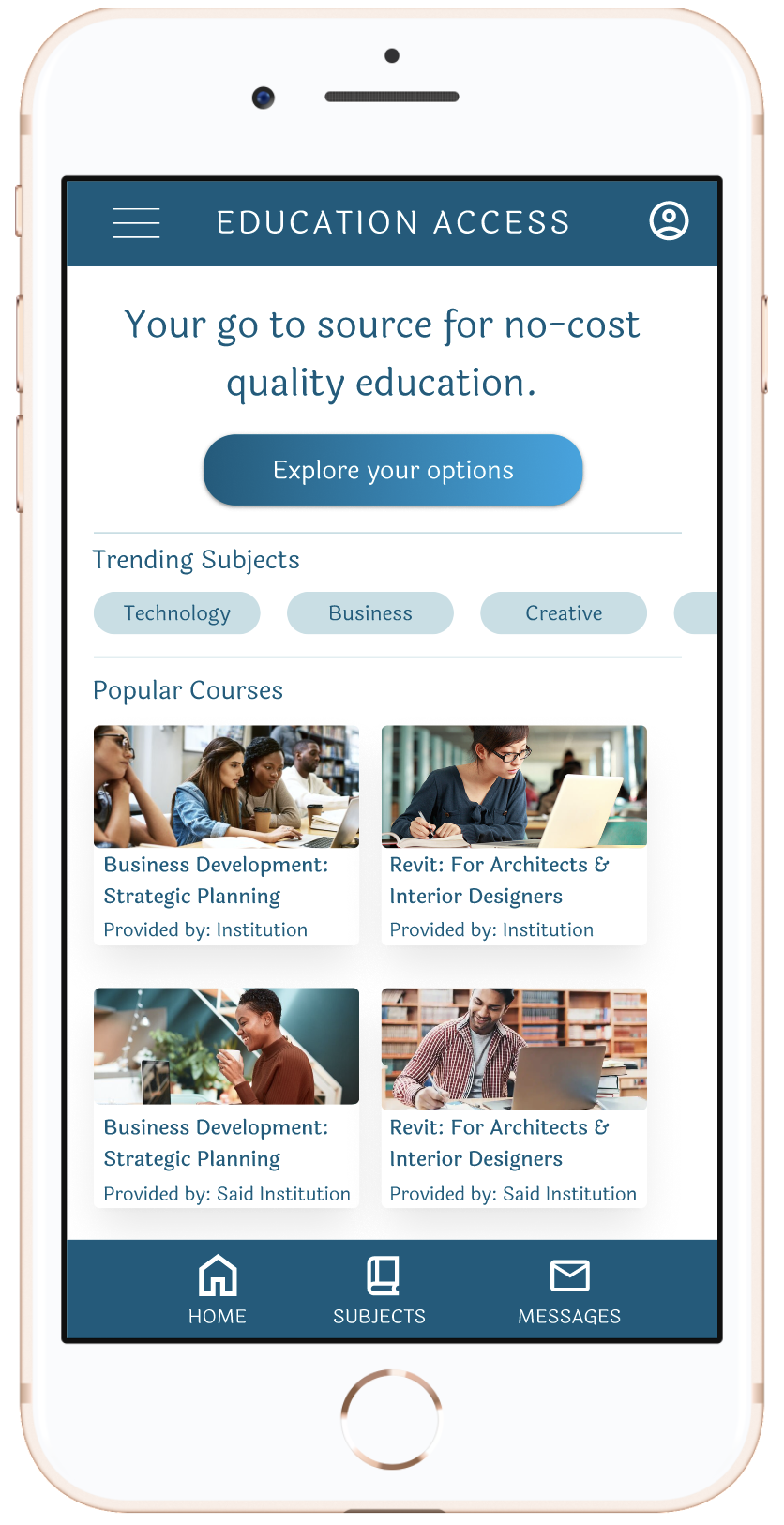
Digital Wireframes
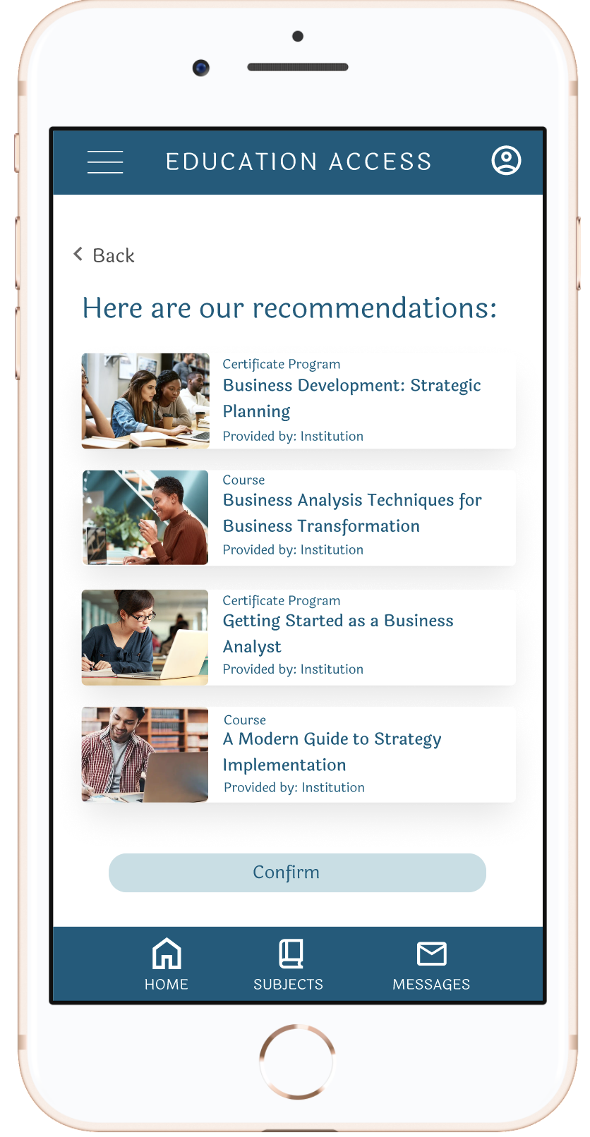
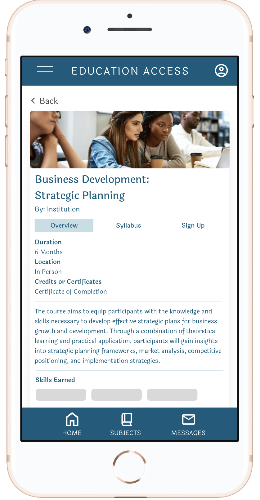
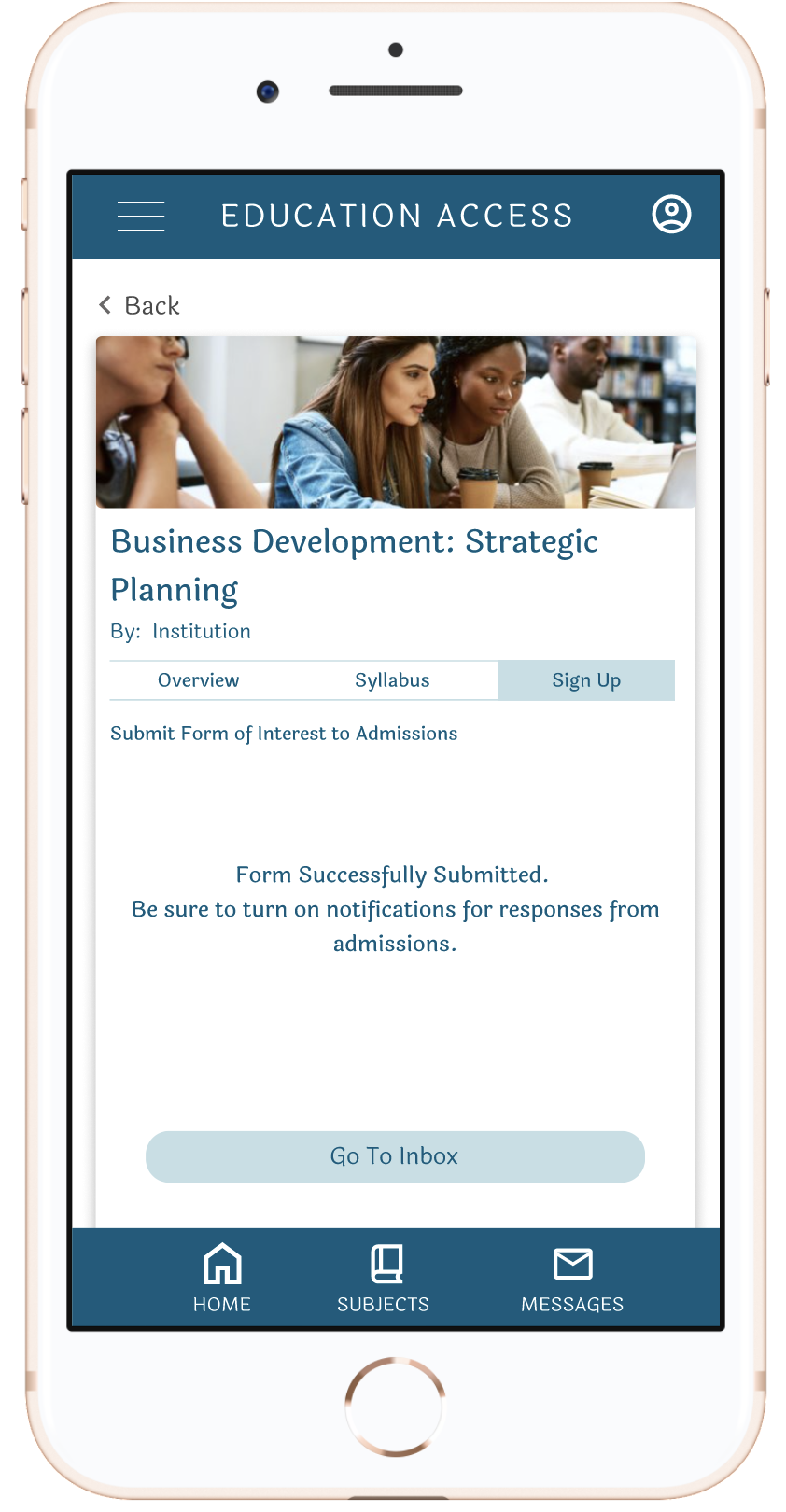
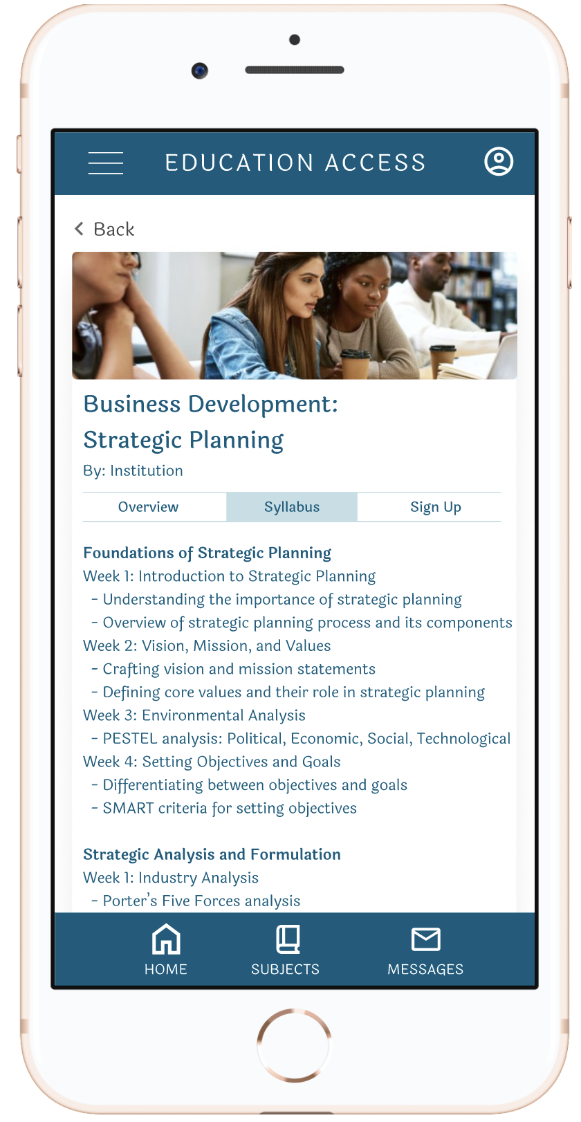
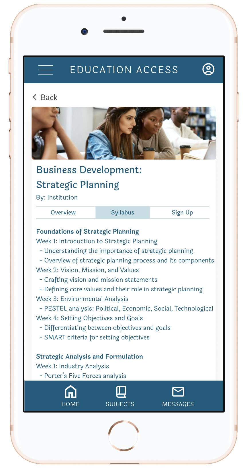
This page is where the courses from many sources have a consistent, summarized layout, unlike if you were viewing on them on the original websites.

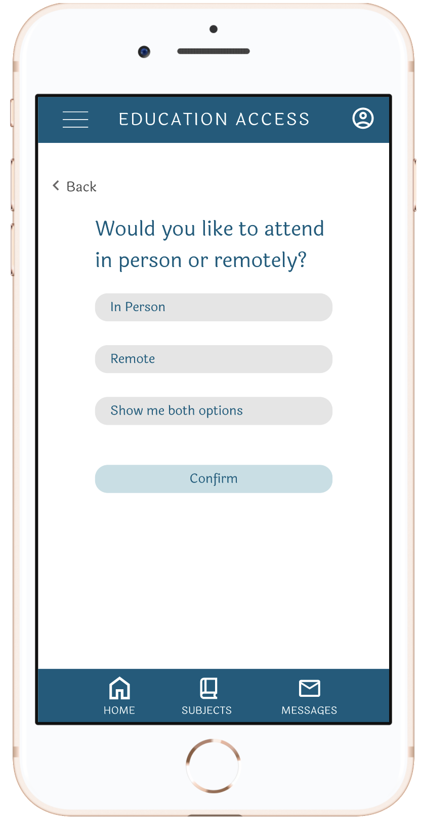
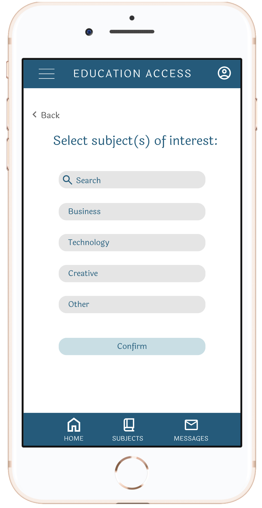
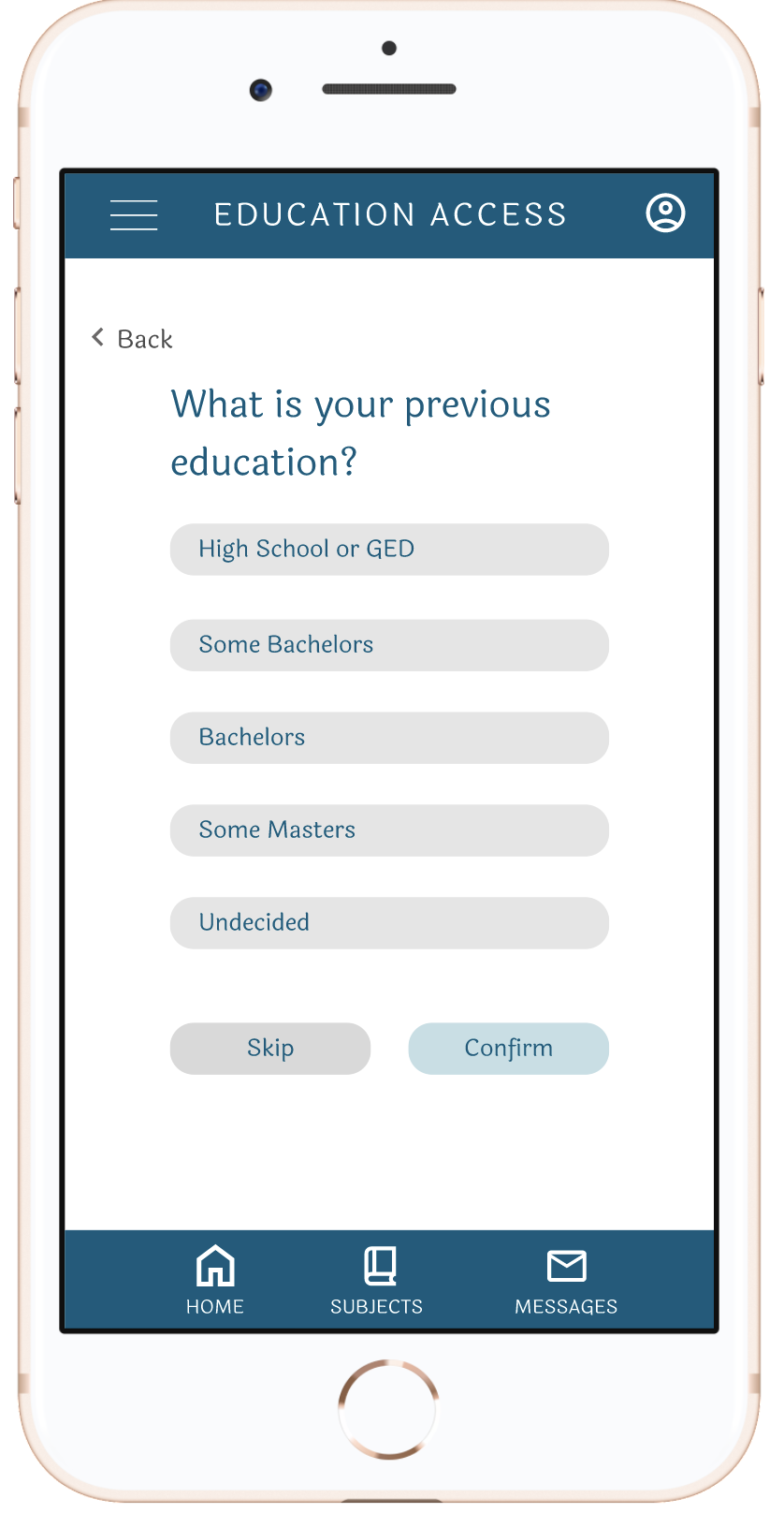
For an app that brings together information from many sources, I thought a quiz would be a good way for users to evaluate what they would like to see.

User Flow
User Research

Before
A high drop-off rate occurred with users taking the quiz. There was no indication how long the quiz will be.

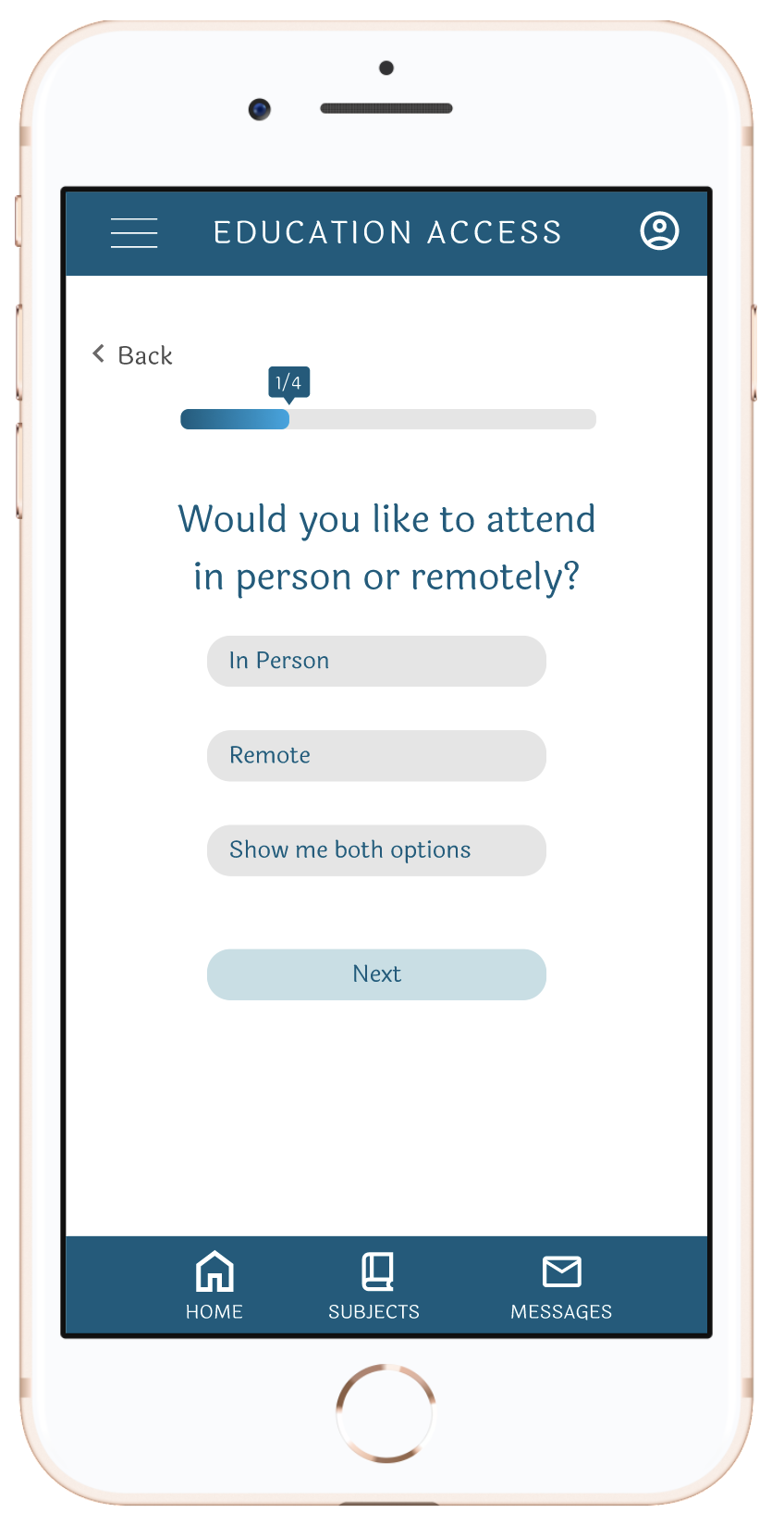
A progress bar with an indication of how many questions are left helps the user be motivated to complete the quiz.
After
Users were overwhelmed with the block of text while they were clicking through the course information

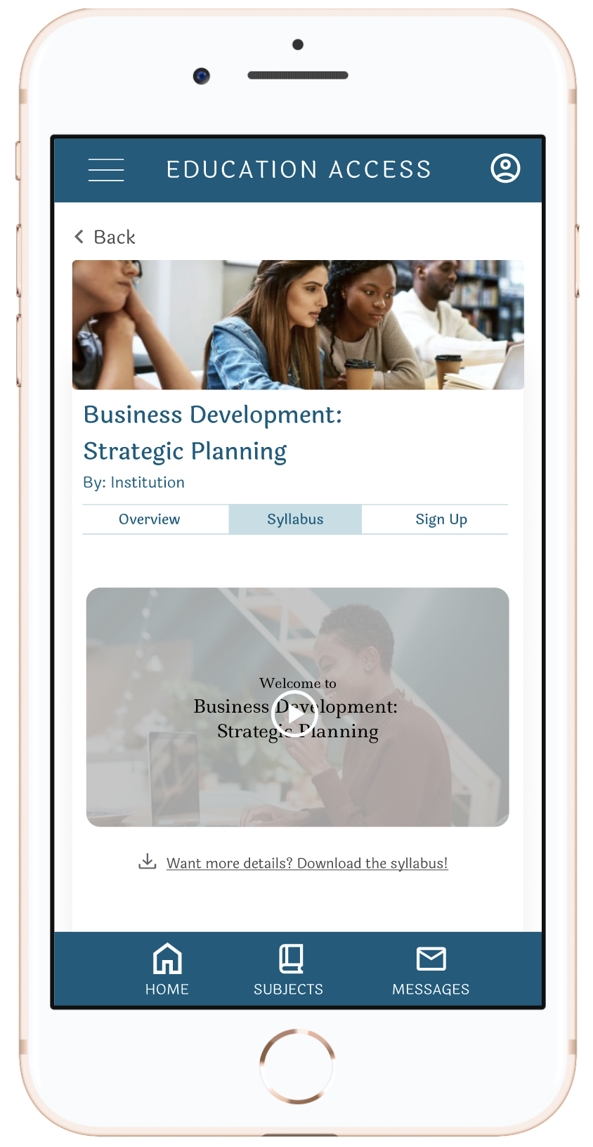
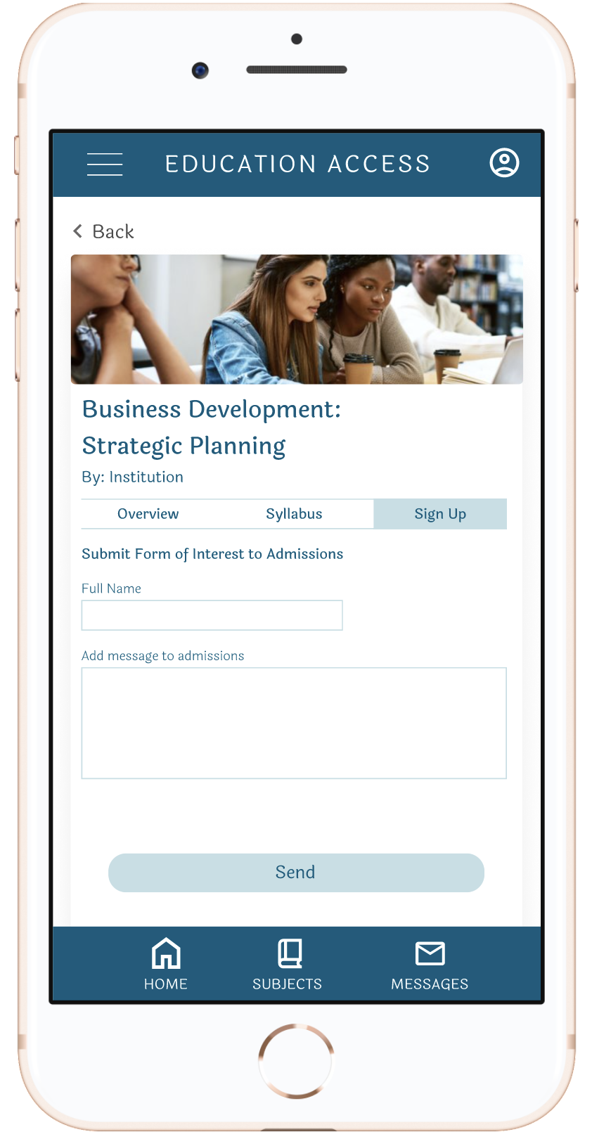
In order to alleviate the fatigue, watching a video giving an overview of the syllabus would help. If the user would like more details, they can now download the syllabus.
What’s Next?
Improvements to UI
I would like to add another font for the body text as well as introduce a new text color to help with hierarchy.
Expand app functionality
I would like to work on more pages and explore what would happen after users book the course. Does the app follow progress of the courses?